KaedeMei
Friday, June 17, 2011
downloaded action
here's the epic rainbow action, yes, downloaded from Kyra's deviantArt. With persmission, of course. Even ask her. :D
before:
after:
before:
after:
Thursday, May 26, 2011
Actions - practice
I used my portrait to create an action. Sadly I can;t save it because I don't own an external drive of any sort, but I'll sttempt to describe it here.
Before:

Before:

After:
Steps were:
1. Change levels: I dragged the grey and white arrows to about the middle of the little level diagram thing.
2. change to greyscale
3. change to duotone
4. first colour: stayed at default
5. second colour: Pantone 2965C
6. Changed filter to the diagonal strokes
7. played with settings and levels in filter until it looked good.
Pantone 2965C's colour is generally called Prussian Blue. :)
Thursday, May 5, 2011
Long Term Assignment - 12 page booklet
For this assignment, I would like to put my interests in history, language, and travel to work, and centre the theme of this booklet around multiculturalism and countries. I plan to incorporate as much from other cultures as possible, mostly using things such as flags, phrases in other languages, and art consisting of perhaps other countries' traditions and clothing. With this booklet, I'd also like to try and promote acceptance between all people and places. :D
Wednesday, April 13, 2011
7 picture examples
(just realized the the second focal point picture is missing. Will update post with it asap.)
Edit: AW DARN, THE LINES FOR THE RULE OF THIRDS STUFF. THEY'RE NOT SHOWING UP. D: *tries to fix*
bird's eye:
worm's eye:
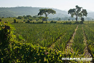
Focal point:
Single leading line:
multiple leading lines:
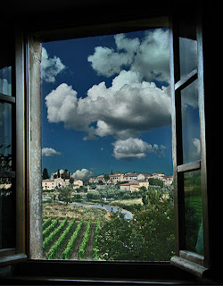
Framing:
Edit: AW DARN, THE LINES FOR THE RULE OF THIRDS STUFF. THEY'RE NOT SHOWING UP. D: *tries to fix*
bird's eye:
worm's eye:
Focal point:
Single leading line:
multiple leading lines:
Framing:
Tuesday, April 5, 2011
Friday, March 18, 2011
art in action poster assignment notes
Poster assignment (Art In Action)
- 11x17 in., 150dpi,
- Includes the image collage.
- Includes a colour scheme (three colours) from the image. One is a dominant and the others are supporting.
- Type….font….style..size. Font should match the theme, or mood.
~~~~
..... now to get the poster image to stop dissappearing. T.T
Subscribe to:
Comments (Atom)


